1 Lokale PDB 1 Master Refreshable Clone 1 Snapshot Clone vom Master Clone
Die Datenbank von 19.9 auf 19.21 gepatched
Nachdem Patch kam es zu einem Fehler..
alter pluggable database MASTER refresh;

* ERROR at line 1: ORA-00283: recovery session canceled due to errors ORA-01114: IO error writing block to file 20 (block # 1) ORA-27041: unable to open file Linux-x86_64 Error: 13: Permission denied
Der existierte eindeutig schon vor dem Datapatch. (da dieser Fehler auf Grund des Snapshots Clones ausgelöst wird)
Jede refreshable PDB wird unrefreshable nachdem ein Snapshot Clone erstellt wurde. Man kann dies nun wieder korrigieren.
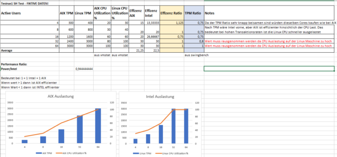
We aim to answer the question: How many Intel CPUs are needed to match the performance of my current Power CPUs while considering Oracle licensing implications?
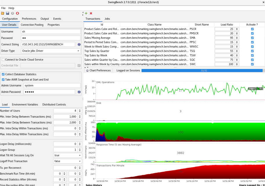
Previously, there were issues capturing CPU and IO metrics in Swingbench using vmstat on AIX. After discussing with the developer, a fix is on the horizon. We had the opportunity to test this fix, and we are thrilled. The need for SSH connect to synchronize OS statistics on Swingbench is eliminated.
CPU Settings Preparation: This is essential to prevent automatic scaling.
A. IBM POWER LPAR Configuration
Please use CAPT LPAR to ensure that no additional resources can be activated.
SMT – please activate (8 Threads)
B. Intel Platform Configuration
Activate Hyper-Threading (2 Threads)
CORE Scenario 1: Purpose for Scenario 1: What’s the actual value of a thread? AIX with 2 Cores (equivalent to 16 Threads) INTEL with 8 Cores (equivalent to 16 Threads)
CORE Scenario 2: Purpose for Scenario 2: Conversion of core performance (license relevant) Equal number of Cores on AIX and INTEL
Comparison Table:
An Excel comparison table between AIX and Linux concerning „Transactions Per Minute“ (TPM) for different numbers of active users (4, 8, 16, 32, 64) is provided to set the utilization in relation.
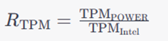
Calculating the relation between AIX and INTEL using the TPM values:
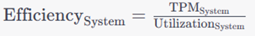
Efficiency calculation of the systems (average value from all test runs SH/OE separated):
Efficiency ratio calculation:
The performance ratio we have calculated can serve as a rough indicator for how many Intel CPUs are required to match the performance of an AIX POWER CPU.
Testing Runs to be recorded: Tip: Oracle Software should be the same Release at minimum, better with the same Patchlevel.
During each test, the CPU performance should not exceed 80%!
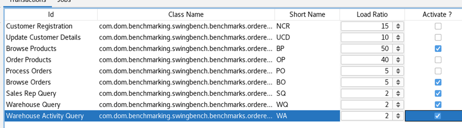
We use the Sales History Schema which is provided from swingbench, but we only install a little dataset approx 100MB.
We load the config and start the test every 5 min with different active user#.
Sales History SETTINGS (DEFAULT) every 5 min with 4,8,16,32,64 Users
We call it: MEMORY ONLY QUERY TEST
CORE Scenario 1: SH Test run 1-6: AIX 13:00-13:30 LINUX 13:30-14:00
CORE Scenario 2: SH Test run 6-12: AIX 14:00-14:30 LINUX 14:30-15:00
works fine ..
To get another Memory Only Szenario we repeat it with a Small SalesOrderEntry (SOE) Schema. OE Settings (without DML) every 5 min with 4,8,16,32,64 Users
Settiongs SOEV2
CORE Scenario 1: SOE_V2 Test run 1-6: AIX 15:00-15:30 LINUX 15:30-16:00
CORE Scenario 2: SOE_V2 Test run 1-6: AIX 16:00-16:30 LINUX 16:30-17:00
Now we enter the results in our given EXCEL Sheet to see a good Comparsion:
One of the challenges faced by database administrators and developers is ensuring secure communication between the database client and the server. Oracle’s Advanced Networking Option (ANO) provides robust security features, including the ability to encrypt connections. Here’s a guide based on a tested configuration to set up SSL using Oracle’s tools.
Prerequisites:
Ensure you have Oracle Client Version 19.14 or higher, as this configuration doesn’t require a wallet on the client side.
This setup is referenced from Oracle’s documentation Doc. 2889040.1.
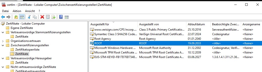
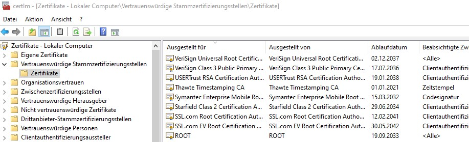
a. Rename cacertificate.txt to cacertificate.crt. Right-click on the CRT file and choose ‚Install Certificate‘ in Windows Explorer. After that you have t move via certlm the cert into trusted root folder
Move it to Vertrauenswürdige StammzertifizierungstellenCorrect Folder
b. For clients update sqlnet.ora:
SSL_CLIENT_AUTHENTICATION = FALSE
And tnsnames.ora: TLS / SSL connection without using a client side Wallet (Doc ID 2889040.1)
swingbenchtls = (description=(address=(protocol=tcps)(host=serverhostname.com)(port=2484))(connect_data=(service_name=SWINGBENCH))(SECURITY=(MY_WALLET_DIRECTORY=SYSTEM)))

(SECURITY= .. is not really needed.. but a good information indeed )
Test the connection using:
sqlplus system/goodoldsystempwd@swingbenchtls
If facing issues with certificate location, check the certificate manager (certlm) and move the certificate to the ‚Trusted Root Certification Authorities‘ folder.
3. On the Linux Client:
a. Use the same sqlnet.ora and tnsnames.ora configurations as in the Windows client.
b. Add cacertificate.txt to /etc/pki/tls/cert.pem.
Now, testing should confirm a successful TCPS connection. When querying for the protocol, the expected result is:
select sys_context ('userenv','network_protocol') from dual;
Output: tcps
In conclusion, using Oracle’s tools and utilities, we can effectively secure the connection between our database client and server. Always ensure you’re following best practices and referencing official Oracle documentation where needed.
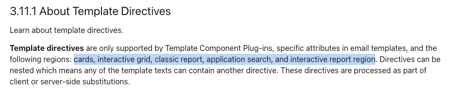
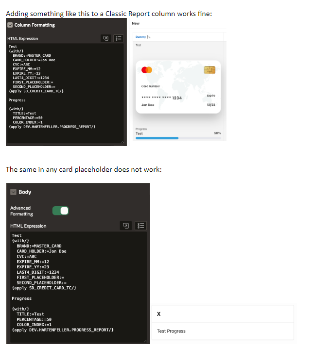
Currently, the Template Components cannot be used inside a Cards region. The reason is that Template Components are rendered on the server and Cards on the client.
We hope to lift this restriction in a future release, we’d like to push the Template Components to the client when needed. We must make sure the functionality is equal, currently the templates behave slightly different.
You can use the {with/} and {apply/} syntax in cards but this is undocumented. You first need to call apex.util.defineTemplates:
I hit Bug 34446152 – [DATAGUARD_BRKR] 19.16 onward broker shows „ORA-16705: internal error in Data guard broker“ (Doc ID 34446152.8)
If you decide to create an DG Environment, do it with 19.14 or 19.20 but not with 19.15-19.19. I have not alot of infos about this Bug. But it is a … maybe you will HIT-Bug.
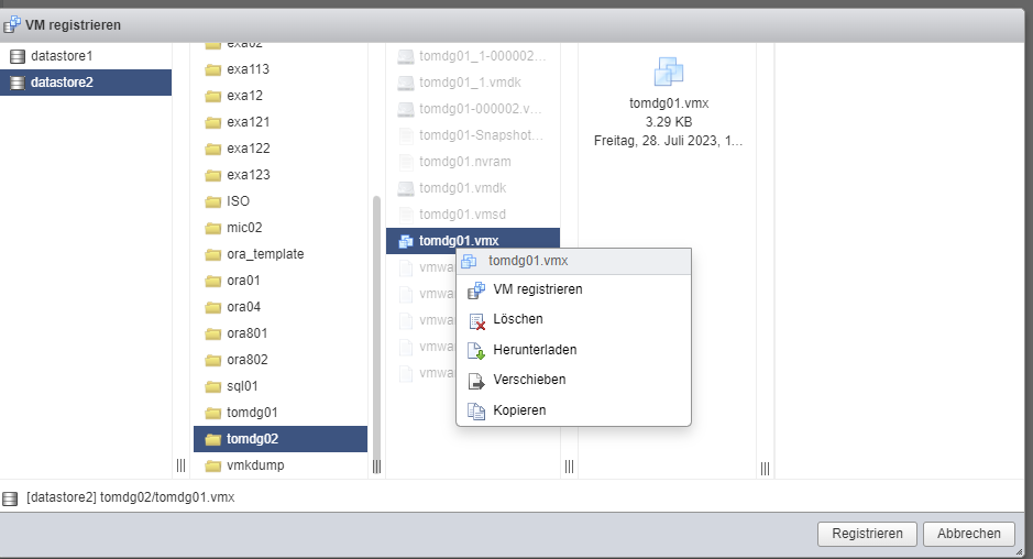
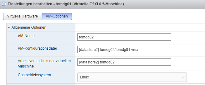
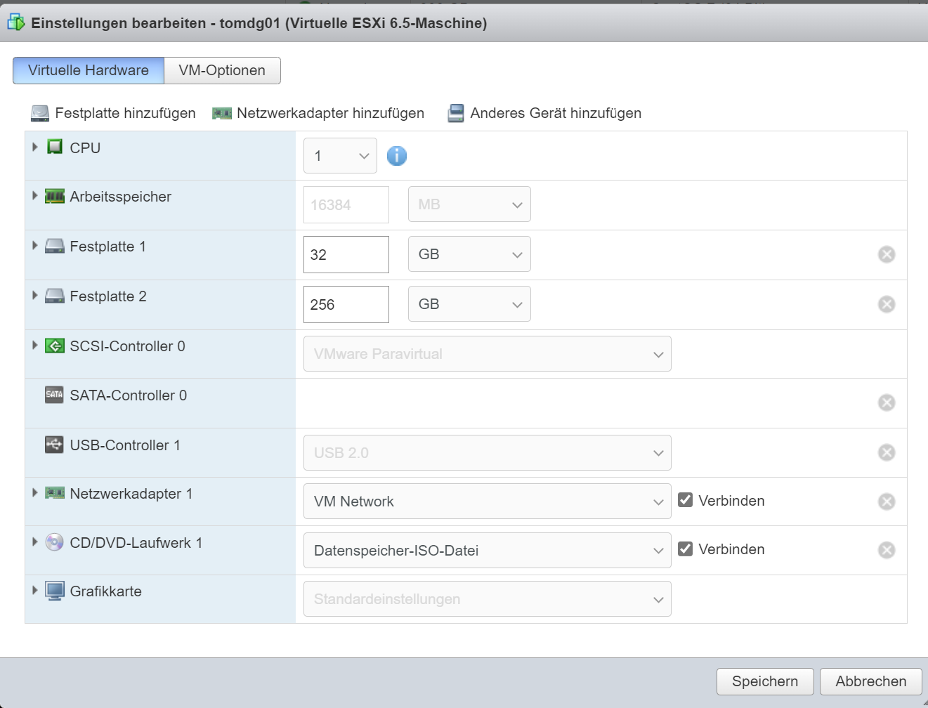
Following Guide helps to startup DG-Standby from previouse cloned VM:
FYI: This Template VM is preconfigured to be ready for Standby Cloning with this steps:
tomdg01:

mkdir /app_oracle/fra/C10P_A/standbylog

sql+ /app_oracle/local/dbsetup/19/crdb/11_standby.sql

vi /etc/oratab => don't start the DB after cloning vm
change listener.ora -- check standby entries
change tnsnames.ora -- check standby entries

/etc/hosts -- add the tomdg02 host + ip
tomdg02:

change listener.ora -- remove the primary and active the standby part
change tnsnames.ora -- same here
mkdir  /app_oracle/fra/C10P_B
cp /tmp/demo_stby.ctl /app_oracle/data/C10P_A/ctrl1.ctl
cp /tmp/demo_stby.ctl /app_oracle/fra/C10P_A/ctrl2.ctl
mkdir  /app_oracle/fra/C10P_B


sqlplus "/as sysdba"

startup nomount;
alter system set db_recovery_file_dest='/app_oracle/fra/C10P_B' scope=spfile;
alter system set db_unique_name=C10P_B scope=spfile;
shutdown immediate;
startup mount;

ALTER DATABASE RECOVER MANAGED STANDBY DATABASE DISCONNECT FROM SESSION;


exit;

lsnrctl start C10P
Now we can start the Primary instance tomdg01
tomdg01:

sqlplus "/as sysdba"
startup;
exit;

lsnrctl start C10P

--test the connection best on both sides!

sqlplus sys/@dg_c10p_a;
sqlplus sys/@dg_c10p_b;
Now lets enable the DG:
dgmgrl sys/@dg_c10p_a

create configuration C10P as primary database is c10p_a connect identifier is DG_C10P_A;
add database c10p_b as connect identifier is DG_C10P_B maintained as physical;

edit database c10p_b set property ApplyLagThreshold=0;
edit database c10p_b set property TransportLagThreshold=0;
edit database c10p_a set property ApplyLagThreshold=0;
edit database c10p_a set property TransportLagThreshold=0;
edit database c10p_a set property 'logxptmode' ='sync' ;
edit database c10p_b set property 'logxptmode' ='sync' ;

enable configuration ;

-- alter system switch logfile --
show configuration;
show database c10p_b;
show database c10p_a;
The Broker shows the Current status of the Standby
If not already exists a „not used“ Oracle Home. create a new one..
dbsw_install dbs 19.EE 19.20
(19.EE is our 19.16 Prepared Image)

Now it will create our new Home in
/app_oracle/product/dbs/19.20

(it will prompt that you have to make an root commando, please do that)
Replace the OPatch utility with the newest Version
Thx WGET its easy , i dont like the support.oracle.com Page to download Patchs..
The 19.20 DB+OJW Bundle Patch

wget --http-user=myuser@sphinx.at --http-password=Dontellu --no-check-certificate --output-document=p35370174_190000_Linux-x86-64.zip "https://updates.oracle.com/Orion/Download/download_patch/p35370174_190000_Linux-x86-64.zip"

The 19.19 DBRU Patch (which cannot be applied at the moment)
i have to wait for 19.20

wget --http-user=myuser@sphinx.at --http-password=Dontellu --no-check-certificate --output-document=p35261302_1919000DBRU_Generic.zip "https://updates.oracle.com/Orion/Download/download_patch/p35261302_1919000DBRU_Generic.zip"
Unpack the *.zip into to /app_oracle/product/dbs/19.20-patch/ (or/tmp)
Set the enviroment to the Target new home:
export ORACLE_HOME=/app_oracle/product/dbs/19.20
export PATH=/app_oracle/product/dbs/19.20/OPatch:$PATH
opatch version

cd /app_oracle/product/dbs/19.20-patch/35370174/35320081
opatch apply
cd /app_oracle/product/dbs/19.20-patch/35370174/35354406
opatch apply
y
y
$ORACLE_HOME/OPatch/opatch lspatches
Oracle recommends to use the autoupgrade Tool to switch the home and install all correctly: You have to create an cfg to use autoupgrade correctly.
cd /app_oracle/local/tools/autoupgrade.jar

vi autoupgrade_patch_CDB.cfg

patch_C10P.log_dir=/app_oracle/log
patch_C10P.sid=C10P1
patch_C10P.source_home=/app_oracle/product/dbs/19.EE
patch_C10P.target_home=/app_oracle/product/dbs/19.20
patch_C10P.start_time=NOW
patch_C10P.run_utlrp=yes
Okay last Check – autoupgrades brings an „analyze“ with it
$ORACLE_HOME/jdk/bin/java -jar autoupgrade.jar \
-config autoupgrade_patch_CDB.cfg \
-mode analyze

cat /app_oracle/cfgtoollogs/autoupgrade/cfgtoollogs/upgrade/auto/status/status.log

looks good -- everthing fine
Okay start the upgrade- now the database is a while unavailable – if it is a singe instance
Within our Sphinx Environment now its needed to change some things
cd /app_oracle/local/etc
Copy our oraenv specific shellscript too

cp oraenv-dbs-19.EE.sh oraenv-dbs-19.20.sh

change the .EE with the current version
vi oraenv-dbs-19.20.sh -- change .EE mit .20

Relink oraenv-default.sh

rm oraenv-default.sh
ln -s oraenv-dbs-19.20.sh oraenv-default.sh

Switch to the current environment an take a look
chenv c10p
sqlplus "sys/sx123 as sysdba"

Also change listener.ora to run on
ORACLE_HOME=/app_oracle/product/dbs/19.20
instead of 19.EE

-- 19.20.0.0 -- all is good
Worksfine, it can be used for x Databases in one Script
In this concise blog post, we present a comprehensive Oracle Installation guide for VMWARE users, focusing on the seamless setup of Oracle Linux 8 (OL8) with Oracle Database 19c.
The journey begins with VMWARE ESXi, where we will lay the foundation for creating a robust Oracle environment. With our step-by-step instructions, you’ll find the process smooth and straightforward, allowing you to get your database up and running efficiently.
Stay tuned as we walk you through the entire installation process, unraveling the complexities and highlighting the essential elements to ensure a successful setup. Your Oracle Dataguard 19c implementation on OL8 in VMWARE will soon be a reality with our expert guidance.
Whether you’re a seasoned Oracle administrator or a newcomer to the world of databases, this blog post will provide valuable insights and help you harness the power of Oracle Dataguard for your VMWARE-based Oracle environment. Let’s embark on this journey together and unlock the potential of your data infrastructure!
CREATE AN VM
VMWARE Settings – 2 DISKs – 1 for OS 1 for Database ( i choose 256 GB for this, but 100 is also enough)
Install Linux
Upon selecting the OL 8 ISO image on the CD/DVD drive, we are now at the VM’s start screen.
OL 8 Startup in VMWARE ESXI Console
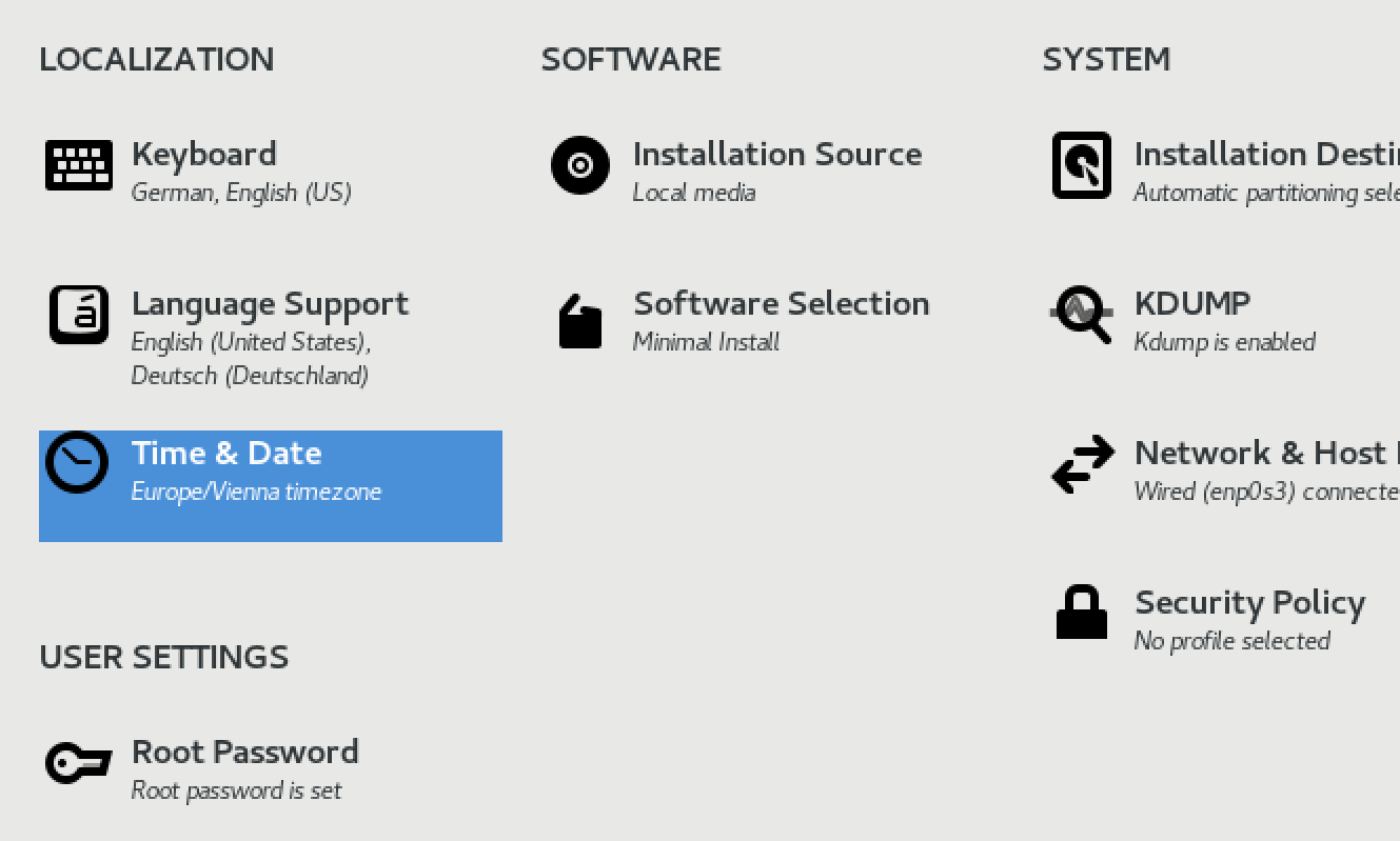
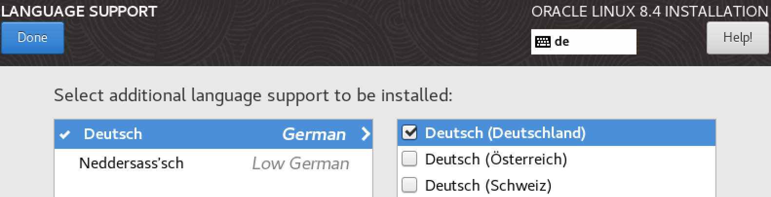
The main setting at this point is Language Support.
Also TIME & Date – Select Timezone Europe/Vienna
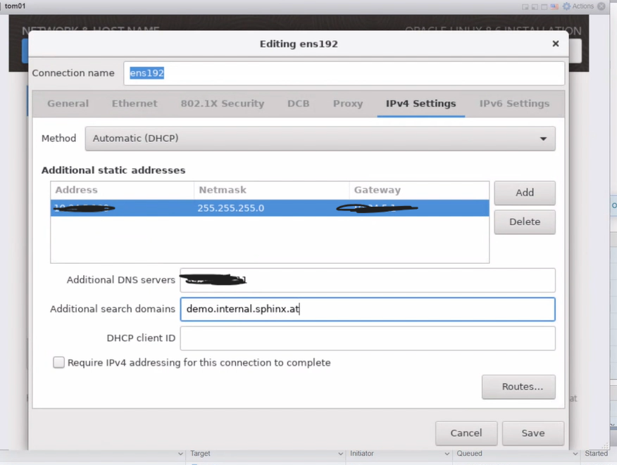
To rectify the incorrect selection, change the Network Settings Method to MANUAL.Ask Tom for DNS Server and Gateway…
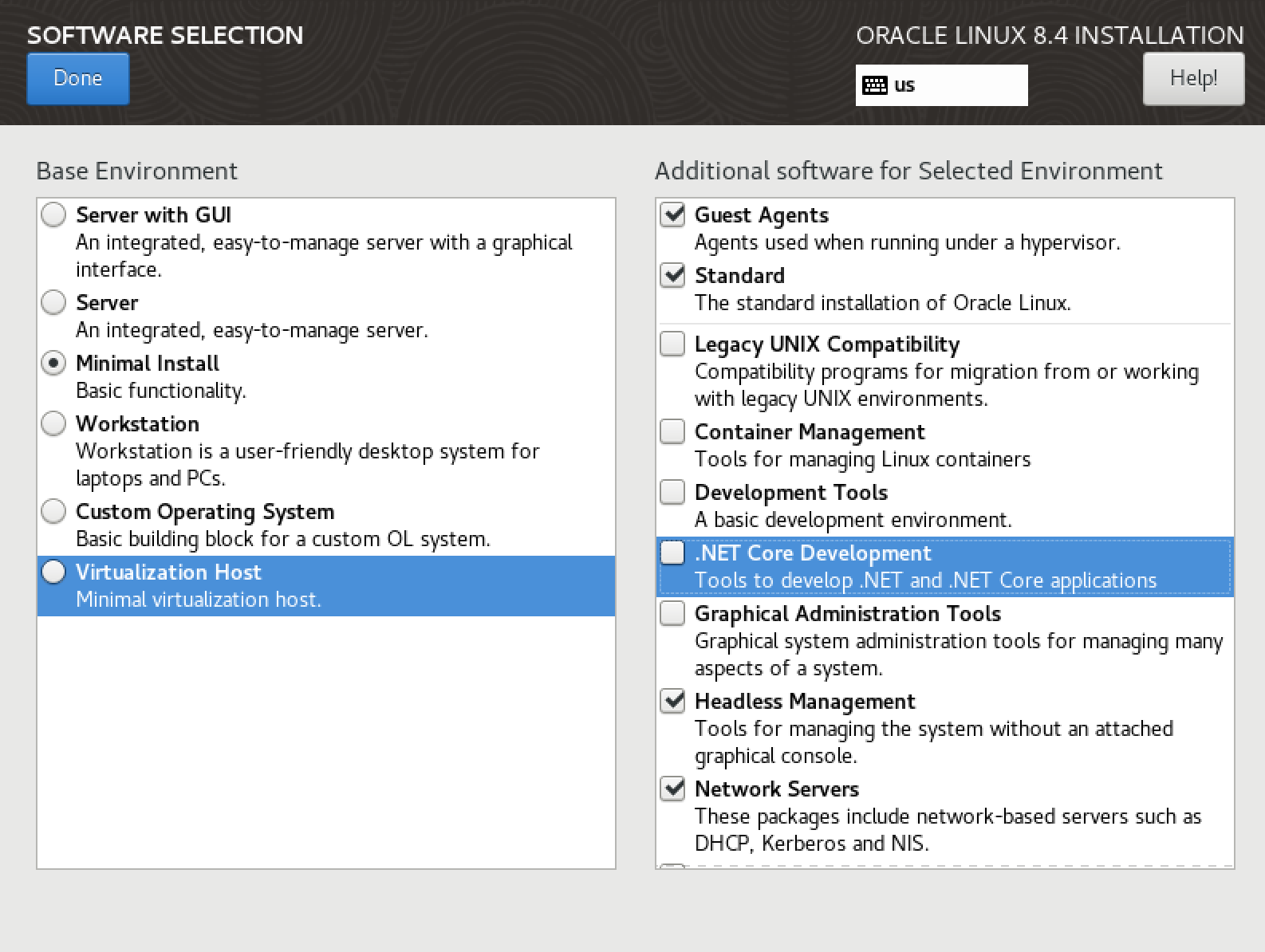
The next step is Software Selection.
You can add additional Software, but you dont need in our Setup
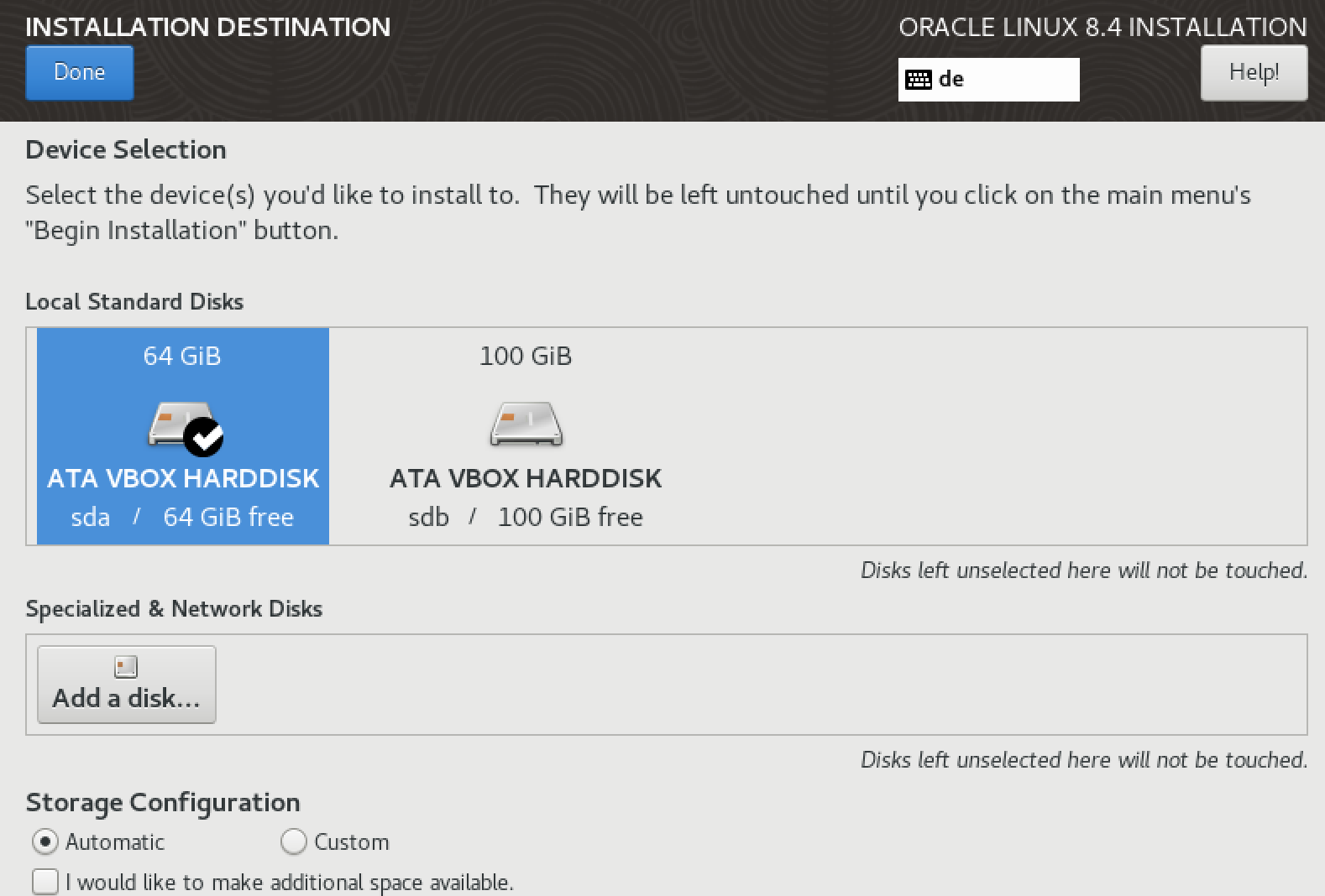
The next step is Installation Destination:
After this Process – change root PWD and start the Installationprocess.
After a while open putty and make ssh connection to the new created vm server:
Install Sphinx Environment Scripts for Linux + Oracle
Now, log in as root and follow these steps:
a) vi /etc/hosts
add or change
10.xx.x.xxx tom.demo.internal.sphinx.at tom
b) vi /etc/hostname - check or rename host
c) vi /etc/sysconfig/network-scripts/i* - check or change ip
Let’s set up the volumes.
Look Logical Volumns
[root@tom]# lsblk

Create Physical Volumn and Volumn Group for sdb (Disk2)
pvcreate /dev/sdb
vgcreate app /dev/sdb

Create Logical Volumns
lvcreate -L 16G -n app_others app
lvcreate -L 16G -n app_oracle app
lvcreate -L 16G -n app_oracle_fra app
lvcreate -L 32G -n app_oracle_data app
lvcreate -L 16G -n app_oracle_exp app

Create XFS Filesystem
mkfs.xfs /dev/app/app_others
mkfs.xfs /dev/app/app_oracle
mkfs.xfs /dev/app/app_oracle_fra
mkfs.xfs /dev/app/app_oracle_data
mkfs.xfs /dev/app/app_oracle_exp

Create directorys
mkdir /app
mkdir /app_oracle
mkdir /app_oracle/data
mkdir /app_oracle/exp
mkdir /app_oracle/fra


And add mount points for it
mount /dev/app/app_others /app
mount /dev/app/app_oracle /app_oracle
mount /dev/app/app_oracle_data /app_oracle/data
mount /dev/app/app_oracle_exp /app_oracle/exp
mount /dev/app/app_oracle_fra /app_oracle/fra
Now it looks like this: [root@tom /]# lsblk NAME MAJ:MIN RM SIZE RO TYPE MOUNTPOINT sda 8:0 0 16G 0 disk ├─sda1 8:1 0 1G 0 part /boot └─sda2 8:2 0 15G 0 part ├─ol-root 252:0 0 13.4G 0 lvm / └─ol-swap 252:1 0 1.6G 0 lvm [SWAP] sdb 8:16 0 32G 0 disk ├─app-app_oracle 252:2 0 16G 0 lvm /app_oracle ├─app-app_oracle_fra 252:3 0 4G 0 lvm /app_oracle/fra ├─app-app_oracle_data 252:4 0 5G 0 lvm /app_oracle/data ├─app-app_oracle_exp 252:5 0 756M 0 lvm /app_oracle/exp └─app-app_others 252:6 0 6G 0 lvm /app
my host
It’s essential to add these mount points to the fstab file.
--now add via vi fstab all mount points to persists on reboot

vi /etc/fstab
/dev/mapper/app-app_others     /app             xfs     defaults        0 0
/dev/mapper/app-app_oracle     /app_oracle             xfs     defaults        0 0
/dev/mapper/app-app_oracle_data    /app_oracle/data             xfs     defaults        0 0
/dev/mapper/app-app_oracle_exp     /app_oracle/exp             xfs     defaults        0 0
/dev/mapper/app-app_oracle_fra     /app_oracle/fra             xfs     defaults        0 0
GitLab is an excellent choice for managing environment scripts. First we need to install git:
yum install git
mkdir -p /media/software
cd /media/software
git clone https://gitlab.oursystem.at/demo/linux.git
git clone https://gitlab.oursystem.at/demo/oracle_root.git

-- install yum packages and other stuff we need in linux
cd linux
./install.sh
reboot

-- install yum packages and other stuff we need for oracle
cd ../oracle_root
./rootpre.sh -i oracle /app_oracle 19
Once the Oracle user is installed, you can proceed with a silent Oracle installation, eliminating the need for the Database Configuration Assistant (DBCA). This streamlined installation method will save time and effort, making the process more efficient.
YES
-- Get our enviromentscripts to handle Oracle easy
su - oracle

git clone https://gitlab.oursystem.at/demo/oracle_local.git local
cd local/etc
ln -s oraenv-dbs-19.EE.sh oraenv-default.sh
exit

su - oracle
We are ready to install Oracle Software 12c-23c now
THX SPHINX
su - oracle
dbsw_install dbs 19.EE 19.EE

mv $ORACLE_HOME/Opatch $ORACLE_HOME/Opatch_old

cd /app_oracle/local/tools
unzip p6880880_210000_Linux-x86-64.zip -d $ORACLE_HOME/

su - root

/app_oracle/product/dbs/19.EE/root.sh
/app_oracle/oraInventory/orainstRoot.sh
We are ready to install Oracle Database 12c-23c
THATS FINE
oranetinit [-f] [-L LDAP-server:port[:ssl-port] -L ...] sqlnet-domain wallet-password sys-password rman-password

Eg:
oranetinit demo.sphinx.at Sx123.45 sx123 sx123

And now DB Environment default settings:
mkoradbenv CDB 19.EE 1521
We ship some Scripts to handle the environment now for example:
chenv CDB -- change the enviroment settings
cd scripts

CAREFULLY: edit and change accordingly

init0.ora (change sqa blocksize aso...)
changed: db_reco_file_dest to 3G

mkoracdb.par (plugdb add a name and a Pluggable DB will be created within the container and the listener will be notified to add a service_name)
changed: redosize = 100M und logmode = archivelog
mkoracdb.sql (only if required)

Create Database: using the command mkoracdb the database will be created as defined in the scripts from before.
It is advised to run this in a screen session as the process can take quite a while.

mkoracdb
Now you have to wait a little but.. until this the Database is installed
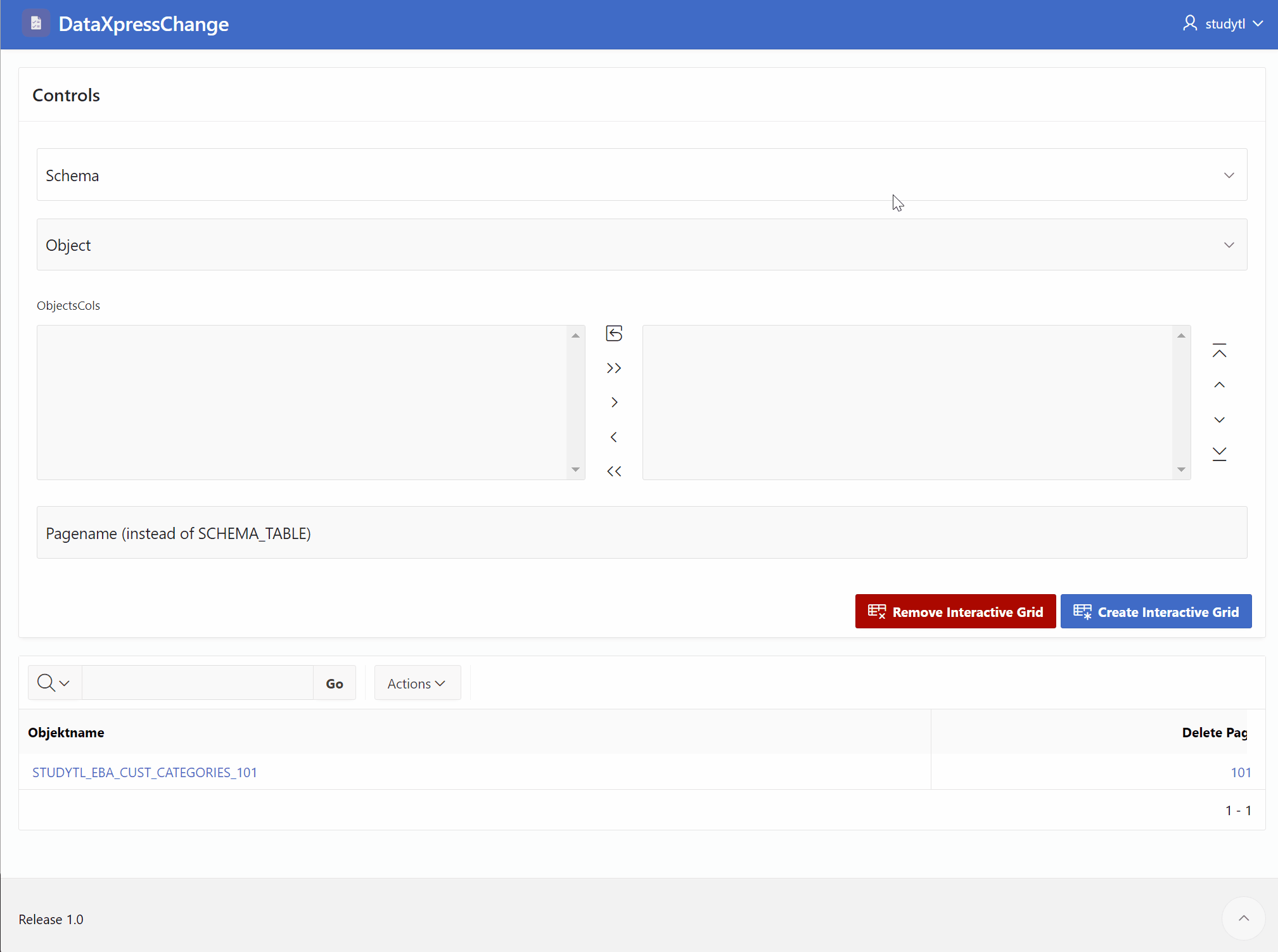
Requirement: Every table of any schema should be editable.
Choose a schema
Choose a table
Select any columns
Generate an editing mask
So, I would say it’s something dynamic, but it works… see for yourself:
Imagine a scenario where you have a database with multiple schemas, each containing various tables and columns. Now, let’s say you have a requirement where you need to allow users to edit the data in any table of any schema. This can be quite a challenging task, considering the dynamic nature of the database structure. However, with the right approach, it is definitely achievable.
To begin with, the first step is to select the desired schema. This can be done by providing a dropdown or a list of available schemas for the user to choose from. Once a schema is selected, the next step is to choose a specific table within that schema. Again, you can provide a dropdown or a list of tables available in the selected schema for the user to pick from.
Now comes the interesting part. The user should be able to select any columns they want to edit within the chosen table. This can be done by displaying all the columns of the selected table and allowing the user to check or uncheck the ones they wish to include in the editing process. This flexibility gives the user full control over the data they want to modify.
Once the user has made their column selections, it’s time to generate an editing mask. The editing mask is a dynamic interactive grid that displays the selected columns as editable fields. It provides a convenient way for the user to modify the data within those columns. The mask should reflect the data type and constraints of each column, ensuring that the modifications are valid and consistent with the database schema.
By following these steps, you can create a dynamic solution that allows users to edit data in any table of any schema. This kind of flexibility empowers users to manage and manipulate their data efficiently, making your database application more user-friendly and versatile.