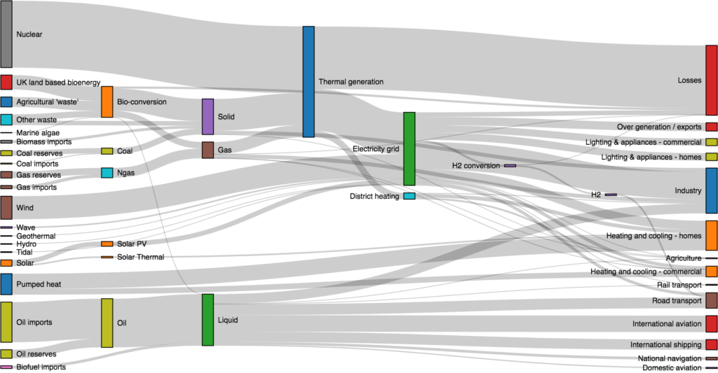
Sankey diagrams can be useful in analyzing voter behavior in elections. They can visually represent the flow of voters between different parties or candidates, as well as the factors that influence their decision-making.
For example, a Sankey diagram could show how many voters switched from one party to another between two elections, and what issues or events may have influenced their decision. It could also show how many voters abstained from voting altogether or how many new voters entered the electorate.
By analyzing the flow of voters through a Sankey diagram, political analysts can gain insights into the dynamics of an election and better understand the factors that determine electoral outcomes. They can also use Sankey diagrams to compare different elections or to track changes in voter behavior over time.
Overall, Sankey diagrams can be a valuable tool for anyone interested in understanding the complex and ever-changing landscape of electoral politics.


