After a new installation of an Oracle 19 CDB+PDB database we always look at the alert.log.
And there were 2 anomalies:
1: ORA-00800:
ORA-00800: soft external error, arguments: [Set Priority Failed], [VKTM], [Check traces and OS configuration], [Check Oracle document and MOS notes], [] Error attempting to elevate VKTM’s priority: no further priority changes will be attempted for this process
ALERt.LOG
So the customer had to open a ticket with RHEL:
The latter already knew the problem:
Removing any software which enabled CPUQuota and/or CPUaccounting on systemd level (usually Insights), or remove the CPUQuota and accounting directives from systemd files. This solves ORA-00800 error without need of changing cpu.rt_runtime_us.
Why does Insights prevent Oracle grid services from starting https://access.redhat.com/solutions/6020561
Oracle Database Enterprise 19c fails to start with error: ORA-00800: soft external error, arguments: [Set Priority Failed], [VKTM] https://access.redhat.com/solutions/6991342
The default value for _min_undosegs_for_parallel_fptr is 100, which you can change to 0. This problem appears to be documented in the note below and fix included in oracle 20.0 version.
Database links in Autonomous Database Shared are the past – Cloud links are the future
Hermann BAER – Oracle PRODUCT MANAGEMENT
Database links have been a popular way to let remote databases access specific tables or views in a database, but they require a lot of back and forth communication to establish the connection. However, with Oracle Autonomous Database Shared’s new feature, Cloud Links, data owners can easily register a table or view for remote access by a certain audience, without needing to set up a connection every time someone needs to access the data. This means that anyone with remote access can discover and use the data that has been made available to them without any extra hassle.
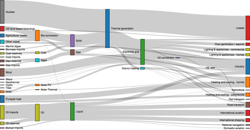
Sankey diagrams can be useful in analyzing voter behavior in elections. They can visually represent the flow of voters between different parties or candidates, as well as the factors that influence their decision-making.
For example, a Sankey diagram could show how many voters switched from one party to another between two elections, and what issues or events may have influenced their decision. It could also show how many voters abstained from voting altogether or how many new voters entered the electorate.
By analyzing the flow of voters through a Sankey diagram, political analysts can gain insights into the dynamics of an election and better understand the factors that determine electoral outcomes. They can also use Sankey diagrams to compare different elections or to track changes in voter behavior over time.
Overall, Sankey diagrams can be a valuable tool for anyone interested in understanding the complex and ever-changing landscape of electoral politics.
Are you feeling overwhelmed by box plots? If so, you’re not alone! Interpreting data can be a daunting task, but it doesn’t have to be. With this beginner’s guide to making sense of box plots, you’ll be able to make sense of data in no time. This guide will provide you with the tools you need to understand box plots and interpret data quickly and easily. So don’t worry, you’ll be a box plot pro in no time!
Making sense of box plots can be a daunting task for beginners. But with a little bit of practice, you can learn to interpret data quickly and accurately.
Box plots are a great way to visualize data, and can help you make decisions about how to proceed with your project.
The first step is to understand the different components of a box plot. The box itself represents the middle 50% of the data, while the whiskers represent the rest of the data. The line in the middle of the box is the median, which is the middle value of the data set. The dots outside the box are outliers, which are values that are significantly higher or lower than the rest of the data. Once you understand the components of a box plot, you can start to interpret the data.
To interpret a box plot, look at the size of the box and the position of the median. If the box is large, it means that the data is spread out, and if the median is close to the center of the box, it means that the data is evenly. If the box small and the median close to one side, it means that the data is clustered around one value.
You can also look at the outliers to see if there are any extreme values that could be affecting the data. With a little practice, you’ll be able to make sense of box plots quickly and accurately.
As a project manager, I know how important it is to stay organized and on top of things. Gantt charts are a must-have tool for any project manager who wants to keep their projects running smoothly. Gantt charts provide a visual representation of a project timeline, making it easy to see which tasks need to be completed and when. With Gantt charts, you can easily identify potential problems and make adjustments to ensure your project is completed on time and within budget. Plus, Gantt charts are easy to use and don’t require any special software or training. So if you’re looking for a simple yet effective way to manage your projects, Gantt charts are the way to go.
Gantt charts are an essential tool for every project manager. They provide a visual representation of the timeline of a project, allowing project managers to easily track progress and identify any potential issues. With a Gantt chart, project managers can quickly see what tasks need to be completed and when, and can easily adjust the timeline as needed.
Gantt charts are also great for keeping stakeholders informed about the progress of a project. They provide a clear picture of the timeline, which makes it easy for stakeholders to understand where the project is at and what needs to be done. This helps to ensure that everyone is on the same page and that the project is running smoothly.
Overall, Gantt charts are an invaluable tool for project managers. They provide a clear and concise timeline of the project, making it easy to track progress and identify any potential issues. They also help to keep stakeholders informed, which is essential for successful project management. If you’re a project manager, Gantt charts are a must-have tool for your toolbox.
Excerpt
Gantt charts are a must-have tool for every project manager. They help you plan and track the progress of your project, and make sure that you stay on track. They’re easy to use and understand, and they can save you a lot of time and hassle. So if you’re a project manager, make sure you get yourself a Gantt chart!
As someone who loves working with data, I’ve always been a fan of visualizing it in a way that makes it easier to understand. Recently, I started using line charts to do just that and it has made a huge difference in how I understand the data I’m working with. Line charts are a great way to visualize data because they provide a clear and concise picture of how a certain set of data points are related. They also allow me to easily identify trends and changes over time. By using line charts, I’m able to better understand the data I’m working with and make more informed decisions.
The Power of Line Charts for Data Analysis
When it comes to data analysis, line charts are a powerful tool. They can be used to track trends over time, compare different sets of data, and identify patterns. Line charts are easy to read and interpret, making them a great choice for visualizing data.
Line charts are a type of graph that plots data points along a line. Each data point is connected by a line, making it easy to see the overall trend. The x-axis of the graph is usually the independent variable, while the y-axis is the dependent variable. This means that the x-axis is usually a timeline, while the y-axis is the value of the data being tracked.
Line charts are a great way to visualize data because they make it easy to identify patterns and trends. For example, if you’re tracking sales over time, a line chart can quickly show you whether sales are increasing or decreasing. It can also show you how sales are changing from month to month.
Line charts can also be used to compare different sets of data. For example, if you’re tracking sales for two different products, you can use a line chart to compare the performance of each product over time. This can help you identify which product is performing better and why.
Line charts are also useful for forecasting. By looking at the trend of the data, you can make predictions about what will happen in the future. This can be especially helpful for businesses that need to plan ahead.
Overall, line charts are a great tool for data analysis. They make it easy to track trends, compare different sets of data, and make predictions. If you’re looking for a way to visualize your data, line charts are a great choice.
Excerpt
I’m a data enthusiast, and I’ve found that line charts are a great way to visualize my data. They help me see trends and patterns more clearly, and make it easier to understand the information I’m looking at. Line charts are my go-to for data visualization, and I’m grateful for how much they’ve helped me better understand my data.
There is an amusing anecdote about a bar chart depicting the pros and cons of coffee versus tea. One day, two colleagues met in the coffee kitchen and noticed the chart on the wall. One colleague was an inveterate coffee drinker, while the other preferred tea.
When the coffee drinker looked at the chart and saw that coffee had more benefits than tea, he began to smile triumphantly and said, „See, I told you coffee was better than tea!“ The tea drinker, however, not a fan of statistics and charts, just shook his head and replied, „That may be, but I’ll stick with tea anyway.“
The anecdote illustrates that while bar charts are a useful and informative way to present data, ultimately the decision of what to consume or do depends on personal tastes and preferences. Nevertheless, the bar chart remains one of the most important chart types to the human eye because it provides a clear and quick visualization of data and is easy to understand, even for people without extensive knowledge of statistics.
How do I turn a single-user app into a multi-tenant app?
yaitcon – YET ANOTHER IT CONSULTANT
Task:
Tom, I want to use your app, but only with my data!
MICHAEL
There are a few ways to achieve this (here only 2):
Clone the app in a workspace and mount it on its own Oracle schema, create all the necessary objects (which you can now define right inside Oracle Apex with the install scripts).
not all sideeffects:
Update of the app means more complex app lifecycle management.
Maybe other processes have to be adapted which also write to the new database or schema.
There might be common data that should be used by all
2. Don’t clone the app and change the data model and customize the APP
not all side effects:
This means you have to filter in the Apex App depending on APP_USER or client of a user.
Depending on how the data is connected to Regions, IG, IR etc., you might have to make an adjustment in each page.
to point 2:
Here we can proceed very effectively because we can use the option of Oracle VPD-Virtual Private Database. We do not need to customize a single view or Apex SQL + PL/SQL query and that is really a huge advantage.
What was to be done?
In my case I had to extend the APP_USER in the relevant tables (of course not in attached views), I call the column MANDANT:
ALTER TABLE CARLOG_DATA add MANDANT VARCHAR2(100);
Next I had to tell the asynchronous load process to assign the data to the user. That means the DML (Insert , Update, Delete) in this table had to be extended by the column MANDANT. It would also have been possible to use a DML trigger that could assign the data correctly. But this was not an „easier“ option for me so I decided to customize the loading process.
As soon as the data of the other client was in the database, I saw my data aggregated with his in the Apex APP. For example, in this specific case, my car drove 133km instead of 100km that day.
Now the Oracle VPD comes into play:
First, create a function that allows to manage more complex criteria in one place: Here I restrict that the check only takes place if the session is in the context of the Apex application 100.
The APP_USER is my client. Oracle Apex automatically sets the APP_USER to the session context after login. Nice…
create or replace function get_mandant_criteria
(
 object_schema IN VARCHAR2,
 object_name VARCHAR2
)
return varchar2 DETERMINISTIC as
l_criteria varchar2(4000);
begin
  -- Only apply VPD to specific APEX applications
  if sys_context('APEX$SESSION', 'APP_ID') in (100)
  then
   l_criteria:=q'#(MANDANT=sys_context('APEX$SESSION', 'APP_USER'))#';
  end if;

  return l_criteria;
end get_mandant_criteria;
/
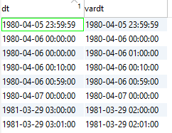
Customer reports that the time does not arrive correctly from SQL Server to Exasol – basically Daylight Saving Times
SPHINX.AT
He even sends a test case that can be reproduced 1 to 1.
Here is a small excerpt from the preparation:
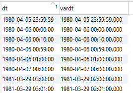
Sql Server: (Create view for testing)
create view datetimetest as
select dt,convert(varchar,dt, 21) as vardt
from (
select try_convert(DATETIME,'1980-04-05 23:59:59.000',102) as dt
union all
select try_convert(DATETIME,'1980-04-06 00:00:00.000',102) as dt
union all
select try_convert(DATETIME,'1980-04-06 00:10:00.000',102) as dt
union all
select try_convert(DATETIME,'1980-04-06 00:59:00.000',102) as dt
union all
select try_convert(DATETIME,'1980-04-06 01:00:00.000',102) as dt
union all
select try_convert(DATETIME,'1980-04-07 00:00:00.000',102) as dt
union all
select try_convert(DATETIME,'1981-03-29 02:00:00.000',102) as dt
union all
select try_convert(DATETIME,'1981-03-29 02:01:00.000',102) as dt
) a;
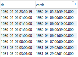
Exasol: (Query the data via Exasol)
SELECT *
FROM ( IMPORT FROM jdbc at con_mssql STATEMENT
       'select * from dbo.datetimetest')
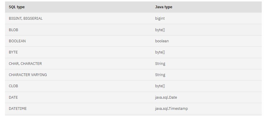
Why can a date actually become a timestamp? Data type of SQL Server becomes Timestamp in jdbc driver. => Because it converts Java/JDBC!
SQL datatyp to Java Type
Which setting must now be set how, so that we take over the DATETIME(2) correctly? It is actually only converted if it does not correspond to the default UTC.
And in ExaOperation we see (not easy to find) the answer: in Extra Database Parameters the user.timezone is set to Europe/Vienna?!
„The exact String is: -etlJdbcJavaEnv=-Duser.timezone=Europe/Vienna“
You barely change this setting and reboot the machine:
USE UTC !
Lo and behold Exasol query now returns the same result as SQL Server:
YES!
Problem solved?
unfortunately NOT – THE PROBLEM IS NOW AT POSTGRES ! IN CASE OF TIMESTAMP WITH TIME ZONE!
After further analysis we found out that due to a bug with Postgres this setting was set to Europe/Vienna. (from 2020)
Now we have to find out if this bug still exists…
In fact there was or is a bug with Postgres datatype timestamp with TIME ZONE… and lo and behold… the bug is still there almost 3 years later.
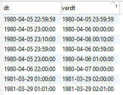
Postgres: (create testview in Postgres SQL)
create or replace view datetimetest as
select  dt dtwotz, dt at time zone 'Europe/Vienna' as dt,cast(dt as text) as vardt
from (
select
cast('1980-04-05 23:59:59.000' as timestamp without time zone) as dt
union all
select
cast('1980-04-06 00:00:00.000' as timestamp without time zone) as dt
union all
select
cast('1980-04-06 00:10:00.000' as timestamp without time zone) as dt
union all
select
cast('1980-04-06 00:59:00.000' as timestamp without time zone) as dt
union all
select
cast('1980-04-06 01:00:00.000' as timestamp without time zone)  as dt
union all
select
cast('1980-04-07 00:00:00.000' as timestamp without time zone) as dt
union all
select
cast('1981-03-29 02:00:00.000' as timestamp without time zone)  as dt
union all
select
cast('1981-03-29 02:01:00.000' as timestamp without time zone)  as dt
) a;
Posgres Query Result
Now still using user.timezone = UTC from Exasol to query on Postgres:
OMG – in EXASOL -1 and -2 diffs?
If we switch back to Europe/Vienna we have the problem with SQL Server.
Therefore we have to decide:
Postgres vs. SQL Server => which system is more important 🙂
Urge Exasol to fix the bug, it is open since 2020.
implement workaround => load it into varchar and then convert it into timestamp with TZ (for SQL Server or for Postgres is basically the same)